I feel that the project has been completed successfully and i have learnt a lot over the last twelve weeks. My favourite ident has to be the second with the skateboarding scene, although i do think that the third idea goes well with the choice of music.
I am very suprised with the outcome of the first ident as the final article is of a lot higher standard than i could have imagined. If i was to change anything, it would have to be the length of the idents. I understand that they are suposed to be short animations but i feel that more could have been added to the first ident. Where as the second and third idents are made up of multiple scenes the first was produced from a single scene.
Overall i have enjoyed extending my knowledge further with 3Ds Max and hope to continue into next year with an understanding of animating with this program. Now i have the basic knowledge i can move on to bigger chalenges.
Thursday, 16 April 2009
Week 11
 This is the background that i developed in Adobe Photoshop to replace the original static/fuzzy background AVI file. The image is simple and uses a slight gradient to add a bit of depth. The original background drew the viewers attention away from the animation. This background is less fussy and complements each of the scenes. I especially like the way it reflects in objects where i have applied materials with a Raytrace.
Week 10
Scene 1...
The first scene of the third ident consists of a camera panning around a hospital bed. The bed contains a broken or sick television set.
The scene is made up of simple objects and i have used my own materials and textures. The hospital bed is made up of an arrangement of cylinders for the frame with two mesh smoothed boxes for the mattress and pillow.
The television set has been made up in the same way as the 'main character' with the exception of the antenna. The antenna on the set are produced using the line tool and then expanding the thickness of the line.
The rest of the scene is constructed from box shapes, with the exception of a few cylinders for the heart monitor stand and the bedside table. The monitor shape was smoothed using a mesh smooth modifier.
The scene is lit by two omni lights with the Shadow function selected to produce the darker areas.
The majority of the textures were all produced in Adobe photoshop. I used a UVW Map to resize the materials when necessary so that they blended well with the rest of the scene. The reflective materials on the TV casing and heart monitor were produced using a Raytrace modifier.
 Scene 2...

The first scene of the third ident consists of a camera panning around a hospital bed. The bed contains a broken or sick television set.
The scene is made up of simple objects and i have used my own materials and textures. The hospital bed is made up of an arrangement of cylinders for the frame with two mesh smoothed boxes for the mattress and pillow.
The television set has been made up in the same way as the 'main character' with the exception of the antenna. The antenna on the set are produced using the line tool and then expanding the thickness of the line.
The rest of the scene is constructed from box shapes, with the exception of a few cylinders for the heart monitor stand and the bedside table. The monitor shape was smoothed using a mesh smooth modifier.
The scene is lit by two omni lights with the Shadow function selected to produce the darker areas.
The majority of the textures were all produced in Adobe photoshop. I used a UVW Map to resize the materials when necessary so that they blended well with the rest of the scene. The reflective materials on the TV casing and heart monitor were produced using a Raytrace modifier.
Scene 2...The second scene was made using the same hospital model. No changes to the materials or lighting had to be made. The television in the scene had been given a path constraint. I created the path using the line tool to give the appearance of a bounce. In the final edit the line doesn't appear in the video as it too small in size to be visible. The television model is the same as the one used in the other two idents.
Scene 3...

The last scene of the ident shows the TV set with a stethoscope rapped around it. The scene is simple but it is effective. Again the TV model remains the same with the addition of the stethoscope. This was made up using the line tool to get the shape and three cones for the other pieces.
 The scene is lit with a stationary upward facing spotlight. All objects in the scene remains stationary except for the camera which pans around the focus point (TV) along a curved path constraint.
The materials for the TV and stethoscope were made using the Raytrace modifier. By changing the diffuse colour i was able to achieve the purple and black colours as well as achieving a reflection.
I created this panel to show a selection of the images i used to create material throughout the three scenes of the third ident.
Week 9
 This image is a screenshot of what the model looks like with all of the new materials. A simple wood effect has been applied to the skateboard whereas other materials have been made in Adobe Photoshop. These materials include the purple bricks that have been applied to the walls and centre block. I had to use a UVW Map to resize the bricks as they were far to big. This was fairly simple to do using the gizmo option under the UVW Map heading.
The material that has been applied to the ramps was created using a Raytrace modifier. Certain levels can be adjusted to alter the level of reflectiveness. I think the levels which i applied suit the purpose of the material and it looks fairly metallic.
The panel below shows the images that were used to create the materials.

Each scene was animated separately. All of the scenes contained path constraints but some were harder to create than others. The scene were the TV performs a 'Kick Flip' was particurly hard as the timings of the skateboard and the TV had to be controlled on two seperate path constraints. All of the cameras were stationary except for the one used in the intro. that followed a straight path.
Week 8
 This is the model which i have produced for the second ident. The model is built upon one box shape. I have cut a cylinder in half in editable mesh mode to create the Half pipe (Ramp) and then duplicated it twice more. The side ramps were produced in the same way, but instead of cutting away half of the cylinder i cut three quarters away.
The centre block is made up of two box shapes and the so are the outer walls. The grind rail is made up of three arranged cylinders.
The skateboard was produced from a box shape, two pyramids and six cylinders. The box was modelled as an editable mesh to get the round edges and slight curve. The cylinders make up the wheels and axles. The pyramids are used to represent the trucks that hold the wheels.

The video shows a prototype edit of the ident before any textures and materials are added.
Week 7
I have managed to come up with a storyboard for the third ident. The idea seems a bit wacky at first but it relates to the programs shown on E4.

The storyboard shows a TV set in a hospital bed and the E4 TV set is depicted as a doctor. From Looking at the storyboard it is easy to see that there will be alot of modelling involved. I will split up the animation into 3 scenes so that the production doesn't get to complicated.
Week 6
This is the first edit of Idea 1. I am not yet sure whether i am keeping the fuzzy background as i feel it draws the attention away from the animation. I may just settle for a plain background using the E4 colours. (Purple, white, black)
The cityscape was created from a selection of box shapes which vary in size. The boxes were arranged one on top of another to give the effect of high rise buildings.
The television fuzz was created using Adobe Flash. Once drawn up the file was exported from Flash as an Avi file and loaded into the 3Ds Max files background setting.
When i come around to adding the final textures to this scene the buildings will have a reflective surface to represent glass. The television will remain the same as i like the simplicity of the object.
Week 5

A requirement of this project is that all of the idents must have an element within the design that connects them. The element that connects my ideas at the moment is the old television set. The object has a simple design but i think it is effective and it ties the ideas together well.
How the television was made:
The television set is a simple object made up of simple shapes. There are four cylinders, two for the buttons and two for the antenna. One box for the main case shape and three cylinders for the antenna.
The box shape which is 10x10x10 segments was converted into an editable mesh. This made it possible to pull out and push in certain areas to create the back of the casing and the screen recess. Once i had finished modelling the box shape i applied a mesh smooth to round off the sharp edges. This made the box appear more cartoon like.
The cylinders were simply resized and rotated to suit there roles. The spheres were added to create the base and tips of the antenna.
Week 4
I quite enjoyed drawing the storyboards for the first two idents as i was able to express my ideas and see what worked and what didn't. Just from the two storyboards i could already see that one of the ideas was stronger than the other. The idea that i consider weaker is the bouncing television. I have no intention of changing the idea as i feel that its best to stick with it, especially with the time i have to complete it. Hopefully on completion of the idea i might be surprised by the outcome.
Overall the storyboard process has been pretty enjoyable, especially as i like drawing. It would have been better to have three ideas down on paper but the third is a work in progress.
Overall the storyboard process has been pretty enjoyable, especially as i like drawing. It would have been better to have three ideas down on paper but the third is a work in progress.
Week 3
In Week 3 i started to think of ideas for the three idents. Using inspiration from the mood boards i had made, i quickly came up with two ideas. The first idea was to create a city landscape where an old style television set would bounce off of the buildings. The second idea was to have the same television set skateboarding in a big E4 themed skate park. I found it harder coming up with an idea for the last ident so i continued with the two ideas i had for the time being.
These are two rough storyboards i did for the two ideas:


These are two rough storyboards i did for the two ideas:
Tuesday, 3 February 2009
Week 2
Choosing a channel.
At first i thought about producing three idents for the MTV channel but felt that there was a limit to the amount i could produce without the work looking like existing MTV idents.
I am pretty sure that the channel i want to use will be E4. I like the channel because it has a very modern look and appeals to a younger audience. I think there are a lot of possible ideas that i could pursue with this channel.

The mood board above is what E4 represents in my opinion. In my opinion the channel is very focused on youth culture. Both the programmes and the identity focus very strongly on a teenage audience.
I created the mood board below to dipict the kind of audience E4 is aimed at. Again the whole mood board is very focused on youth.

Tuesday, 27 January 2009
Semester 2 Week 1
The brief for this Semester is to produce three idents for a TV channel. I have yet to come up with any ideas and haven't yet chose the channel that I wish to use. I think that the project is going to be challenging as it is the first time I have animated anything using 3Ds Max.
Class Activity
In class we were asked to think about the most memorable corporate ident that we had seen on TV.
I think that the msot memorable idents I have seen have to be the slug animations on BBC 3.
Click this link to view some examples of these idents.
http://uk.youtube.com/watch?v=1zccNjxOaEY
I think these idents are the most memorable for me as i find the animations quite amusing. The channel shows a lot of comedy so the idents reflect this perfectly.
Tuesday, 20 January 2009
Week 12
In Week 12 I had nothing left to do other than check over my work. With the designs all finished I decided to check the parameters and properties of the images and altered them when necessary to achieve the best possible results.
Overall I feel that the project has been a success. I have managed to produce three images that I feel are of a fair standard. The final images have turned out as planned and are good representations of the original skecthes.
Week 11
This image shows the final scene for the month of November. I have re-worked the people in the crowd and have added the fireworks background.
The background was created using Adobe Photoshop. I took multiple images of fireworks and cut them all into one image. I also changed the colours to fit in with the rest of the scene.
 I re-worked the crowd by adding more detail to the figures. The image below shows where i have used soft selection to model the heads of the models. Starting with a sphere i then pulled out and depressed parts of the shape to achieve a rough head shape. The main areas of detail are the mouth, eyes, nose and the hat.

The background was created using Adobe Photoshop. I took multiple images of fireworks and cut them all into one image. I also changed the colours to fit in with the rest of the scene.
I re-worked the crowd by adding more detail to the figures. The image below shows where i have used soft selection to model the heads of the models. Starting with a sphere i then pulled out and depressed parts of the shape to achieve a rough head shape. The main areas of detail are the mouth, eyes, nose and the hat.A lot of the November image was created via means of experimentation. I like the look of the image although it may not be the most technical of the three scenes. I am a lot happier with the final outcome of this particular scene as i was worried originally that i would not be able to create a convincing image.
Week 10
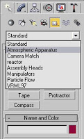
To create the fire i used a Sphere gizmo. These can be found by selecting the helpers icon. Once selected there is a drop down menu where you need to choose the Atmospheric Apparatus option.
This week i have drawn up a table to show you step by step how to create the fire. Click on the table to view it in a larger scale.

This week i have drawn up a table to show you step by step how to create the fire. Click on the table to view it in a larger scale.


Week 9
As planned the July scene was finished by week 8. This week i started experimenting with creating realistic looking fire and creating believable people. From what i have produced the outcome has not been to my liking and i feel as though i need to work more with soft selection to achieve a better quality when modeling people.
Looking at the image below the crowd looks very simple and basically look snowmen with one sphere on top of another for the body and head. The fire effect is ok but i think more can be done to achieve a higher level of realism.

Looking at the image below the crowd looks very simple and basically look snowmen with one sphere on top of another for the body and head. The fire effect is ok but i think more can be done to achieve a higher level of realism.
Week 8

 The water
As you can see i decided to change the water for my final image. The methods i used to create the water were the same as those which i used to previously.
I started with a simple plane to which i added a noise modifier. This time around i didn't raise the settings as high so that the deeps and peeks in the water were further apart.
With the properties of the noise modifier now set i felt the the plane still looked to be too rough. To compensate this i added a mesh smooth modifier. This appears to make the pool look a lot calmer.
With this second attempt at creating the water i also experimented more with materials. In the material editor window i chose to play around with the Raytrace parameters to achieve a reflection in the water.
 This screen shot shows the parameters, options and colours which i selected to create the custom material.
At first when i applied these settings i was worried that they had not worked. After some time i realised that in order to get a decent reflection i needed to add an image in the background.
I wanted a reflection of clouds in the pool so that is what i searched for. I felt that the background image shown in the final scene was the best image for the composition.
Compared to my first attempt, the water in the final image looks alot more realistic. I think that if you spend that little bit of extra time on producing aspects of your work the outcome can be alot better, and that is what i did.
Week 7
This is the very first image showing the water effect which i had created. I do like the effect but i am not to sure about the outcome and feel that the look of the water would be better suited to a beach scene. The water in a swimming pool is much smoother with hardly any current at all. As well as this the water appears to have no reflection. I may decide to change the water once i have completed other aspects of the design.

 The sun loungers

Throughout the week i have continued with the idea and have added some new objects. These objects are the umbrella and the sun loungers.
 The umbrella
The umbrella started out as a sphere with 32 segments. To get the umbrella shape you then have to convert the sphere into a hemisphere by simply selecting the option in the menu bar.
I needed to convert the shape into an editable Poly and then delete the bottom to get a recognisable umbrella shape.

 With the basic shape completed i wanted to make the object more realistic by protruding sections to simulate the frame work of the umbrella.
To do this i used the line selection tool in the top view to select parts of 16 lines around the hemisphere. There are 32 lines around the hemisphere, so to get equal spacing i selected every other line. Once all of the line parts are selected use the loop option as it will then highlight the whole of each line.
With the lines selected i simply used the scale tool to drag them out to create the protrusions. The shape looked a bit rough at first so i added a chamfer amount of 0.1 and then applied a mesh smooth modifier.
To finish off the object i will go on to model a simple stand. I intend to use basic shapes as a stand shape is not very complex.
The sun loungersIn theory i thought the sun loungers would be easy to make. During the process i found it very hard to angle the shapes to create the slats for the back rest. The slats are box shapes and the frames are made up of cylinders. Once i had modeled one i then duplicated it to achieve the second. All that was left to do was place them within the image.
I feel that the idea of the loungers work well within the composition of the image. The objects are simple but appear effective.
Week 6
My next idea for the month of July was to create a pool scene. This relates to the idea of holidays. With a little bit of practice using 3Ds Max, i now felt that i should attempt to create a scene using more complexed methods compared to those used to create my October scene.


The screen shot shows the idea in progress. There are aspects of this idea that i think need improving to create a more believable image. I plan to finish this idea by Week 8.
Subscribe to:
Comments (Atom)